Another alphabet. The same personality.
Hebrew adaptations of The Suicide Squad, The Batman and Scoob! titles. The challenge: preserve each film’s identity and keep the title readable in another alphabet.
- My role
- Lettering, typographic adaptation and graphic effects
- Agency
- Zivlin
- Period
- August–November 2020
Rebuild, letter by letter.
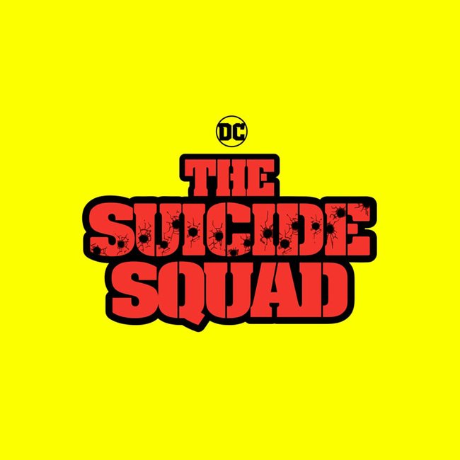
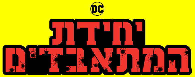
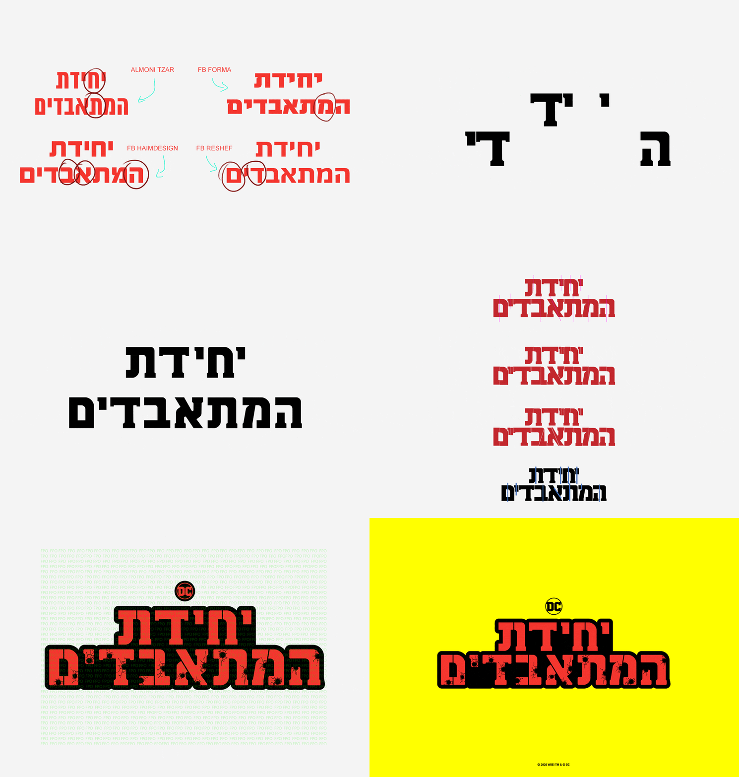
The entire logo had to be rebuilt: adapting the Hebrew letters, incorporating the original serifs and balancing legibility with personality. Compare the reference with my adaptation.
Identity lives in the details.
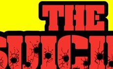
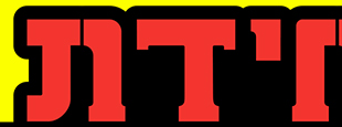
The serifs, proportions and effects needed to belong to the same visual language. These details are crops from the original and final artwork, making the adaptation work visible.

A different rhythm.
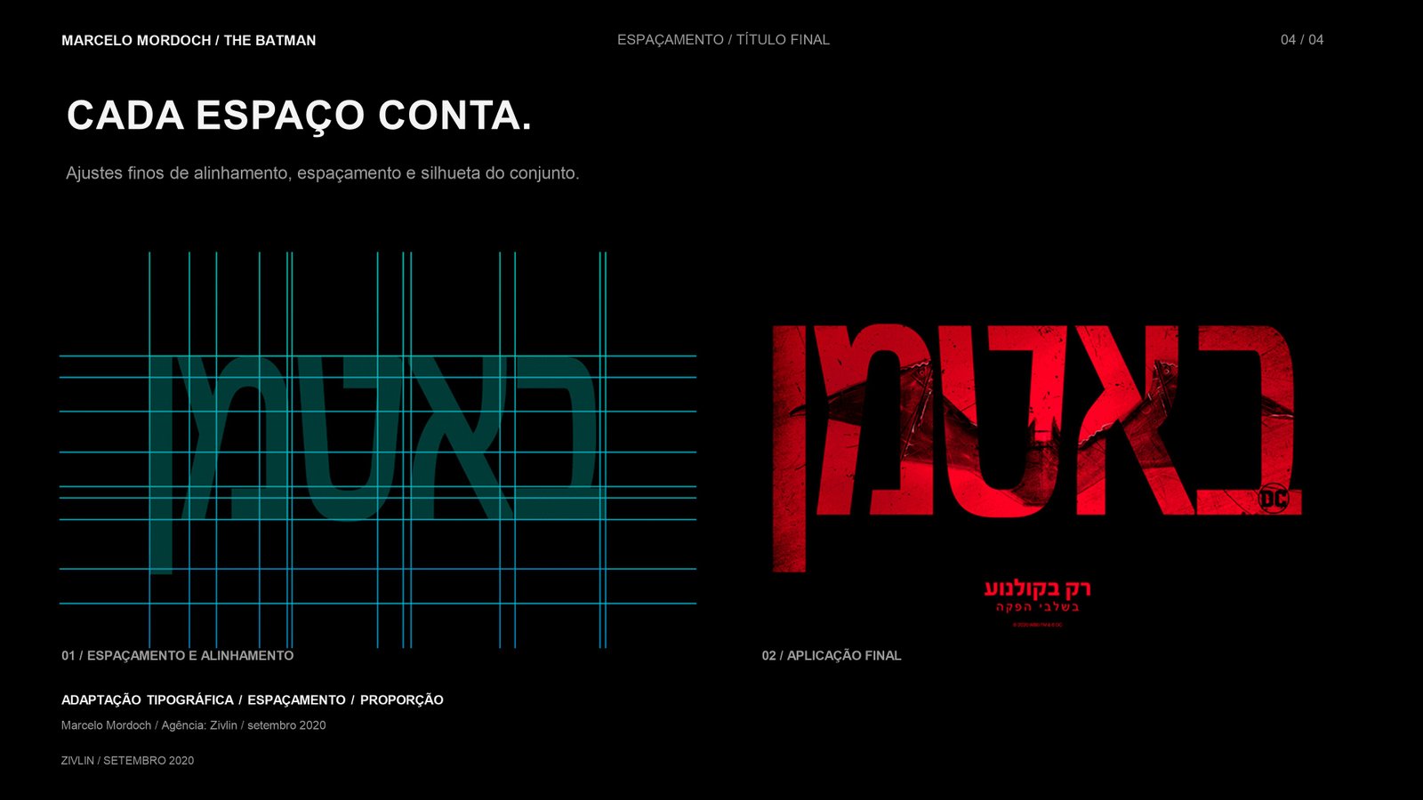
For Batman, the focus was typographic adaptation, spacing and proportion. Letters from another alphabet needed to work as a whole and preserve the presence of the original title.

Each film needs its own solution.
The collection closes with the Scoob! pieces developed for Zivlin in November 2020. The applications show the title within the visual language of the posters.

See the moving artwork
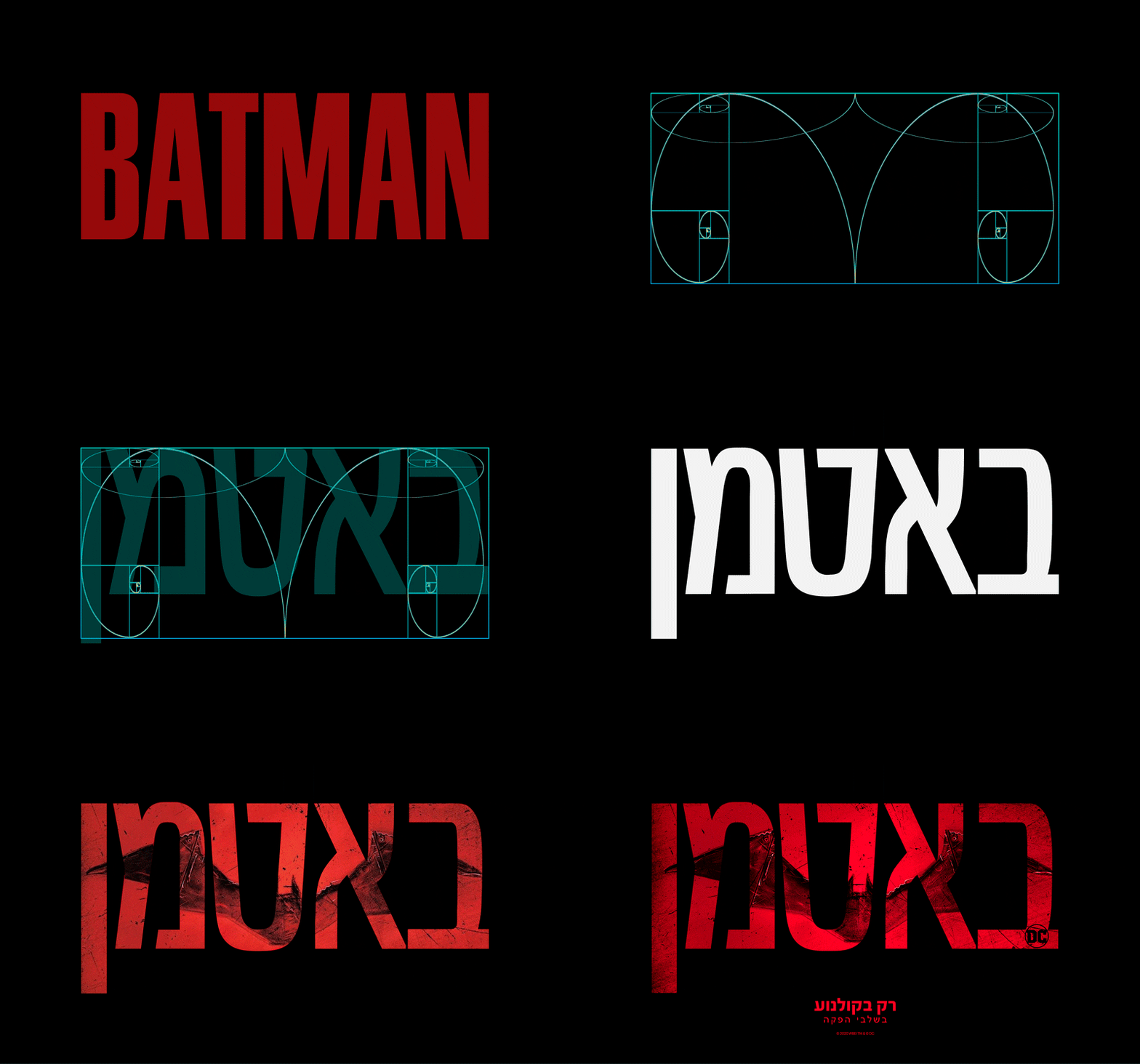
My work was adapting the titles to Hebrew. The original film identities are shown as references.