A few projects. The decisions behind them. Follow what catches your eye.
01 / 03
A DIFFERENT POINT OF VIEW.
Ideas have a way of moving.
FORGET HOW WEBSITES WORK FOR A MINUTE.
WHAT DO YOU WANT TO SEE?
0 / 5 paths explored
LETTERING / WARNER · DC
01 / WHAT I SEE · WARNER / DC
DIFFERENTALPHABET.SAME ATTITUDE.
Rebuilding an entire title in another alphabet. Keeping the original character. Making every Hebrew letter readable.
THE WORK BEHIND THE LETTERS ↓
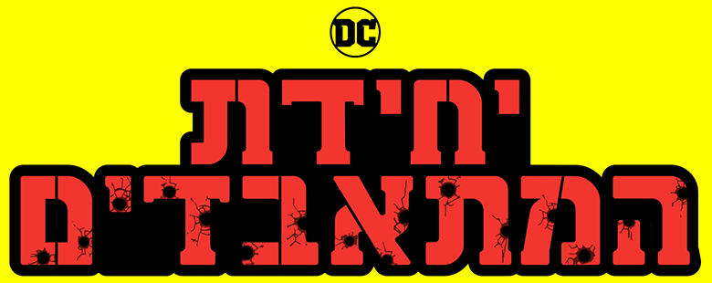
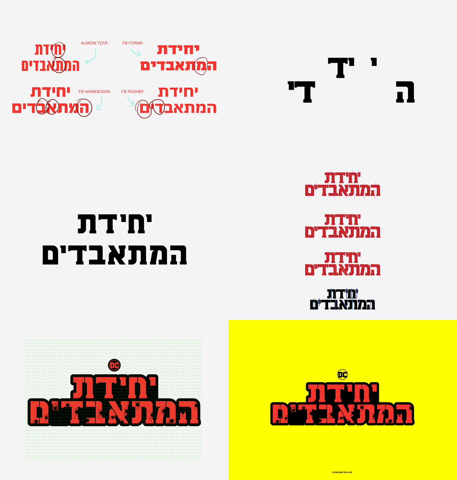
THE SUICIDE SQUAD / HEBREW TITLEZIVLIN / AUGUST 2020MY ROLE / LETTERING & GRAPHIC EFFECTS
The words had to change. The personality had to stay. Every serif, every proportion, every letter had to belong to the same film.
01 / THE CHALLENGE
New letters. The same identity.
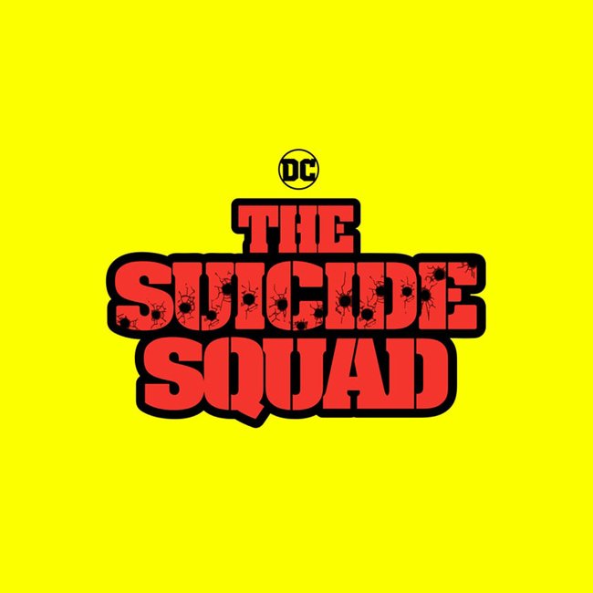
The original logo had a very specific personality. My task was to rebuild the entire title in Hebrew, adapting the letterforms without losing the characteristics that made it recognisable.
That meant working on the shape of the letters themselves, while keeping the title legible in a different alphabet.
THE REFERENCE / ORIGINAL ENGLISH TITLE
02 / REBUILDING THE LETTERFORMS
The character is in the details.
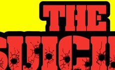
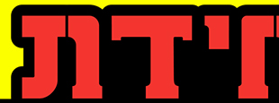
The serifs were central to the original logo’s identity. Reconstructing the title took substantial work: those details had to become part of the Hebrew letters, while respecting their shapes.
The close-ups show the relationship between the original lettering and the finished adaptation.
ORIGINAL / SERIFS
HEBREW / ADAPTED LETTERFORMS
DETAILS CROPPED FROM THE ORIGINAL AND FINAL ARTWORK
03 / LEGIBILITY
Keep the voice. Let the letters read.
The challenge was to preserve the original characteristics and still make the Hebrew title readable. Each letter had to work as part of the logo and remain recognisable within its own alphabet.
These studies show the letterform differences considered during the adaptation.
PROCESS / HEBREW LETTERFORM STUDIES
04 / GRAPHIC EFFECTS
Carry the personality through to the finish.
After rebuilding the lettering, I applied the graphic effects. The red letters, heavy black outline and distressed marks bring the adapted title into the visual world of the original.
FINAL ARTWORK / GRAPHIC EFFECTS DETAIL
05 / THE RESULT
A different alphabet. The same film.
Now compare the original title with the finished Hebrew adaptation.
↔
HEBREWORIGINAL
Drag the circle across the image to compare. Use arrow keys when focused.
Custom Hebrew lettering and graphic effects / Marcelo Mordoch / Zivlin, August 2020.
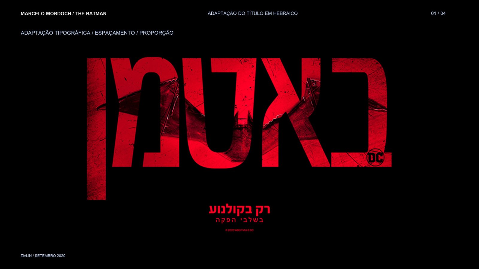
After The Suicide Squad’s heavy serifs, another typographic challenge: adapting The Batman’s tall, condensed title to Hebrew through proportion and spacing.
THE BATMAN / HEBREW TITLEZIVLIN / SEPTEMBER 2020MY ROLE / TYPOGRAPHIC ADAPTATION
01 / THE TYPOGRAPHIC LANGUAGE
Translate the title. Preserve its presence.
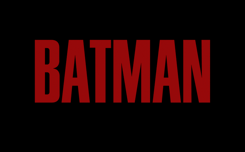
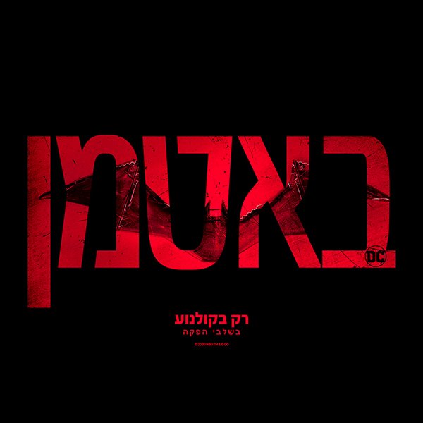
The task was to adapt the typography to Hebrew, adjusting spacing and proportion while preserving the original title’s visual character.
Different letterforms need different decisions. The goal was a readable Hebrew title with the same condensed, imposing presence.
ENGLISH REFERENCE / HEBREW ADAPTATION
02 / PROPORTION
Shape the letters. Balance the whole.
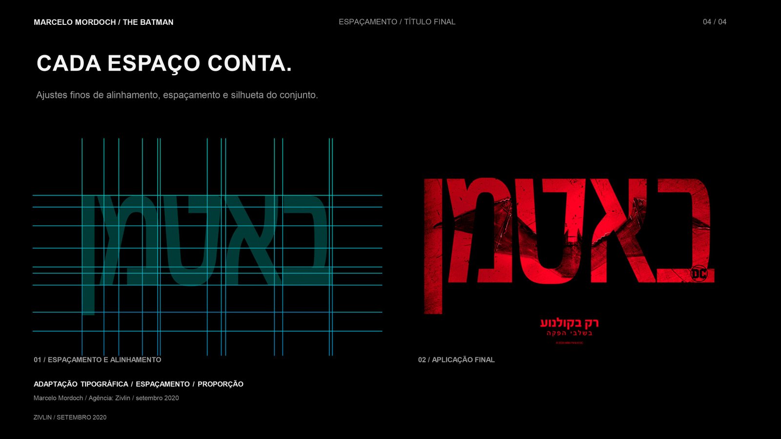
Adapting the title meant considering the proportions of the Hebrew letters and the shape they create together. Width and height affect both the reading and the overall silhouette.
The presentation brings the letterforms and proportion study together so those relationships can be seen side by side.
PROPORTION / LETTERFORMS AND OVERALL SHAPE
03 / SPACING
Every space changes the rhythm.
The spaces between the letters are part of the title’s identity. Adjusting them helps the word read as a single visual unit, while keeping the Hebrew legible.
This view places the spacing study alongside the finished title.
SPACING / STUDY AND FINISHED APPLICATION
04 / COMPARE THE TITLES
Another alphabet. The same presence.
Move the circle across the image to compare the supplied English reference with the finished Hebrew application.
↔
HEBREWORIGINAL
Drag across the image. On the keyboard, use arrow keys, Home or End.
THE FINISHED PRESENTATION / THE BATMAN
Typographic adaptation, spacing and proportion / Marcelo Mordoch / Zivlin, September 2020.
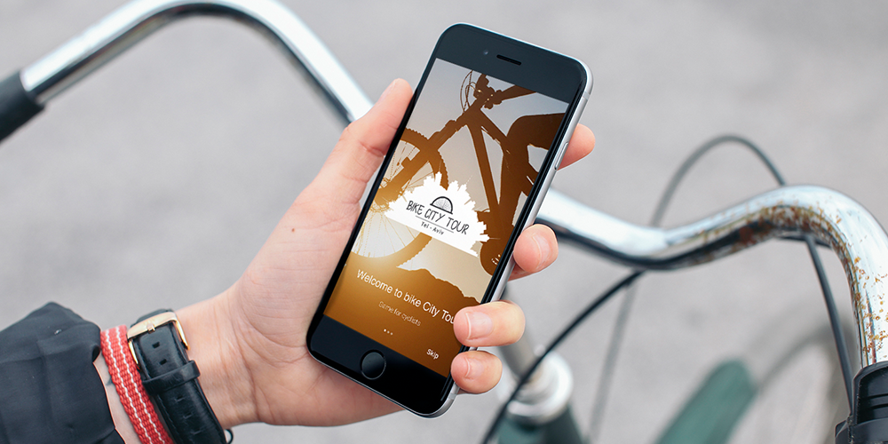
A personal app concept that connects cycling, local discovery and a community. I developed the concept, identity, UX and UI myself.
FOLLOW THE THINKING ↓
PERSONAL PROJECT / 2019MY ROLE / CONCEPT · IDENTITY · UX · UI
01 / THE STARTING POINT
A ride can be more than a route.
The idea grew from my own bicycle rides. The app brings places, personal interests and cycling into the same experience: find somewhere worth noticing, then take the discovery outside.
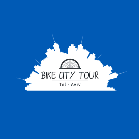
This was a self-initiated project. The identity and interface were designed as parts of the same product.
IDENTITY / BIKE CITY TOUR · TEL AVIV
02 / FOLLOW THE PRODUCT LOGIC
From a place to a plan.
Choose a stage. See the screen and the role it plays in the journey.
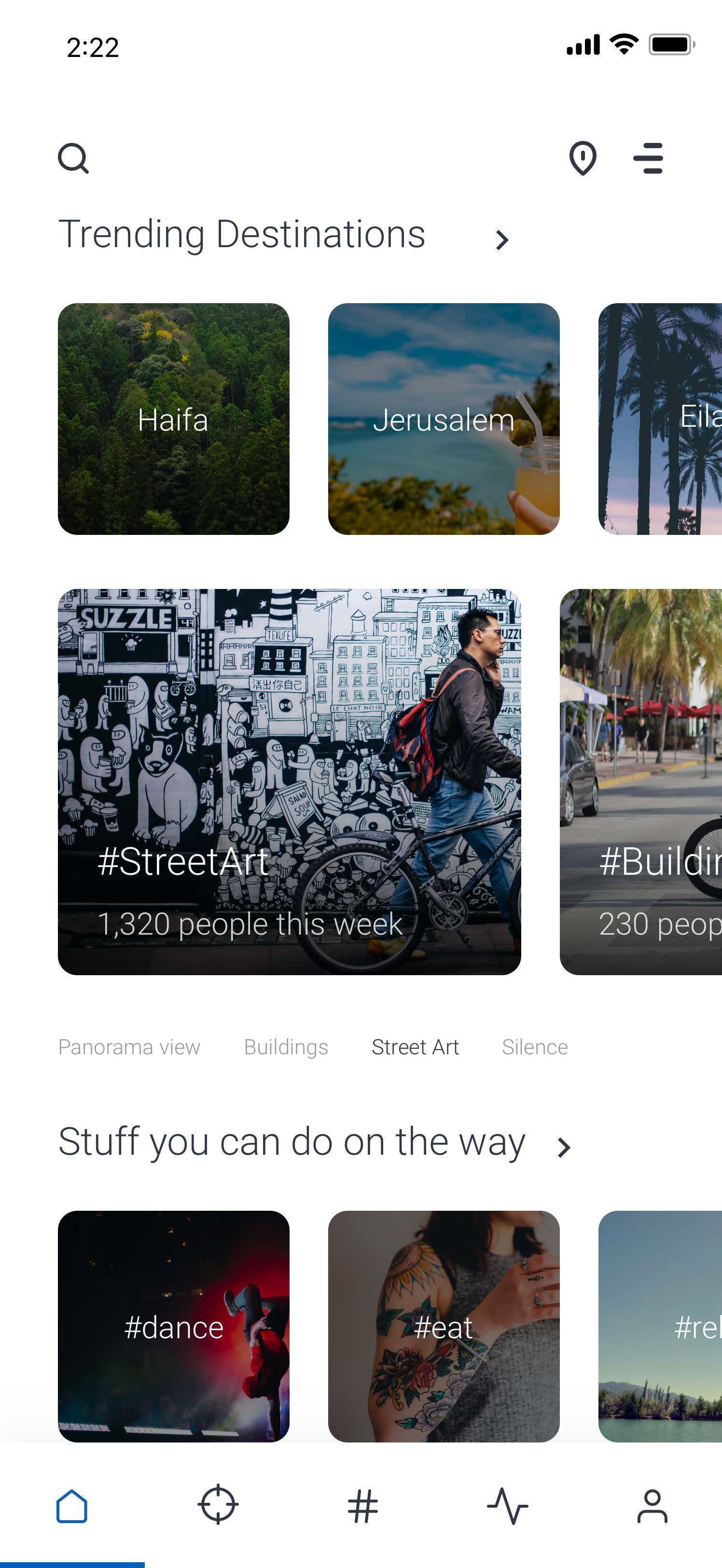
Discover a place. Choose what interests you. See how it becomes a ride.
Start with a reason to explore.
Destinations and local places give the ride a purpose before a route is chosen.
Explore selected screens / Original 2019 interface
DISCOVER / Destinations and local places
03 / AFTER THE RIDE
A discovery worth returning to.
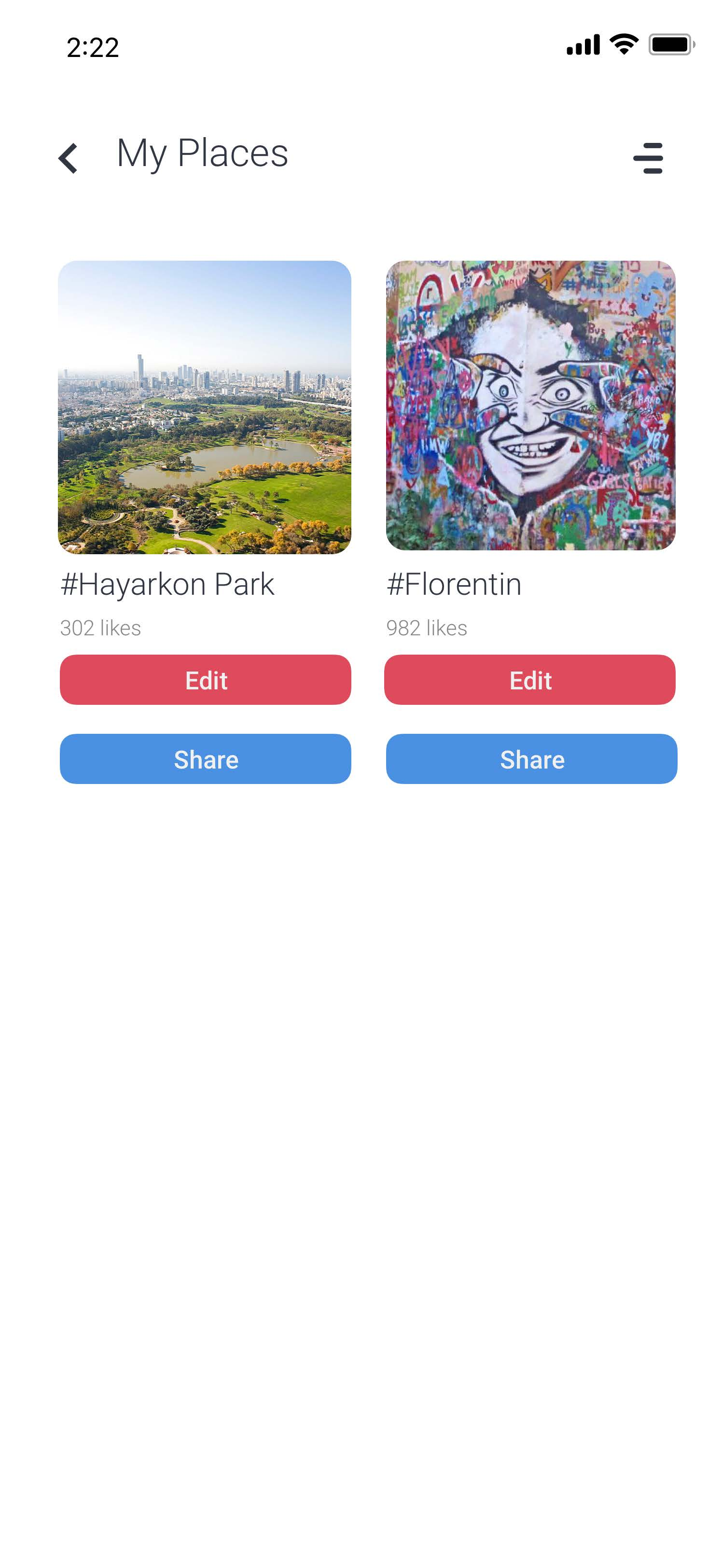
The product extends beyond the route. Saved places hold personal discoveries, the activity feed brings in the community, and rewards add another reason to explore.
Keep places you want to revisit and share.
ORIGINAL SCREENS / PERSONAL PLACES · COMMUNITY · REWARDS
04 / SEE IT IN MOTION
The original walkthrough.
Original 2019 interface / App concept
Concept, identity, UX and UI by Marcelo Mordoch. Personal project, 2019.
Campaign assets become a sequence: an opening, a message and an invitation to act. Selected motion executions for B3 / HUB3, Mercato and C6.
FOLLOW THE THINKING ↓
MENTAL MARKETING / 2023–2024MY ROLE / ANIMATION & MOTION EXECUTION
01 / THE EXECUTION
One message. More than one moment.
These pieces bring campaign elements into time. The work shown here is my animation and motion execution through Mental Marketing.
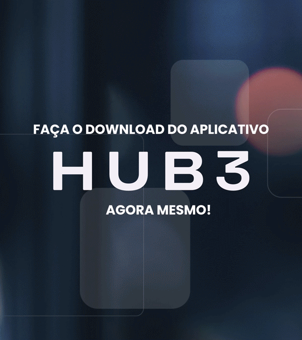
HUB3 presents an app and its benefits. Mercato promotes a summer offer. C6 Auto communicates a financing event. Each piece has its own message to carry through the sequence.
MERCATO / CAMPAIGN ARTWORK · MOTION EXECUTION, JANUARY 2024
02 / READ THE SEQUENCE · HUB3
First, introduce. Then, invite.
Look at three selected moments from the animation. The message moves from introducing the app, to a benefit, to the download invitation.
Introduce HUB3 and the investment app proposition.
SELECTED FRAMES FROM THE FINISHED ANIMATION
03 / WATCH THE WORK
Hold the frame. Then let it move.
Choose a campaign. Switch between a selected still and the complete animation.
HUB3 / App message, benefit and call to action / February 2024
The animation had limited reach. Looking back, I would approach its visual language differently. There is still something worth keeping — and something worth learning.
FOLLOW THE THINKING ↓
TOMIGO / PRODUCT ANIMATIONMY ROLE / ANIMATIONLOOKING BACK / A PERSONAL REFLECTION
01 / THE CONTEXT
A real product. A real opportunity.
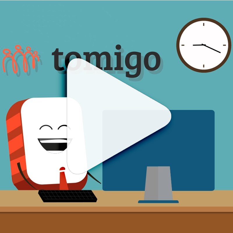
The product launched. Tomigo was selected by Startup Nation and received investment. This animation was part of communicating what the company does.
It did not reach a large audience. The reflection here is about the animation’s reach and tone.
THE ORIGINAL ANIMATION / WATCH WITH TODAY’S EYES
02 / MY RETROSPECTIVE
Keep the clarity. Rethink the tone.
Choose a lens for looking at the original piece. These are my reflections today.
“
It still communicates what the company does.
The message remains understandable. That is the part I would preserve in a new approach.01
03 / THE EXPERIENCE WAS WORTH IT
A different eye. The same curiosity.
It wasn’t a blockbuster. It feels too childish for a serious subject. Today, I would choose a more mature visual language and keep the explanation clear.
The experience was worth it.
Looking back helps me see both what communicates and what I would change. That is the value I take from this project.
Animation by Marcelo Mordoch. Retrospective based on my assessment of the original piece.
Two self-initiated concepts that start with the city. Google Maps invites a detour. Spotify invites a different way to listen.
FOLLOW THE THINKING ↓
SELF-INITIATED CONCEPTS / 2026MY ROLE / CONCEPT · ART DIRECTION · VISUAL DESIGN
01 / GOOGLE MAPS · THE IDEA
Same destination. A richer journey.
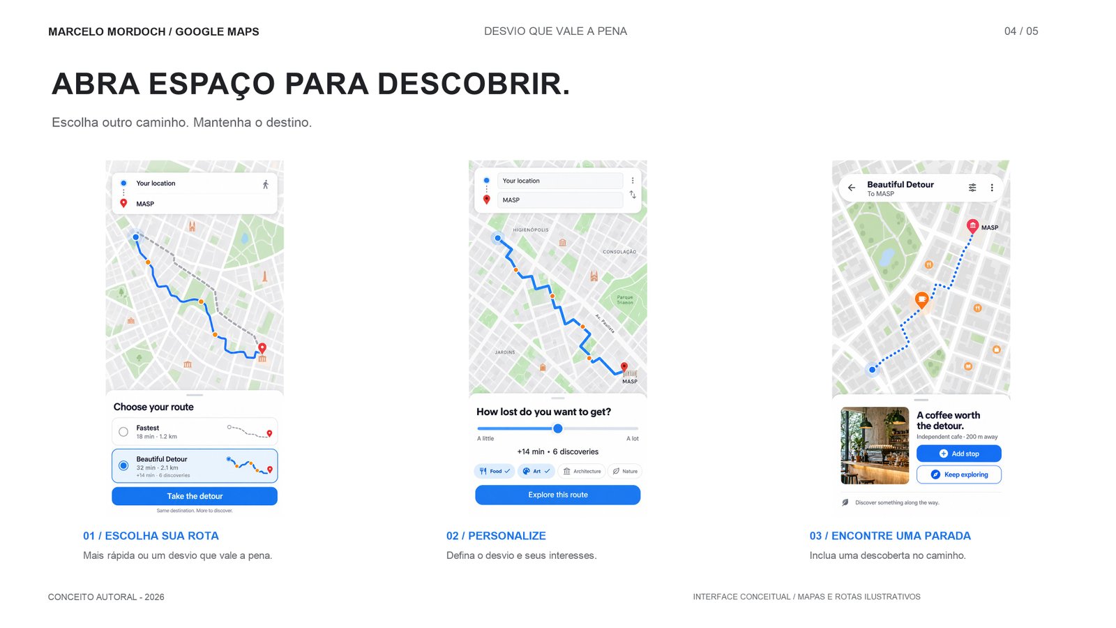
The fastest route isn’t always the most interesting one. Beautiful Detour imagines an alternative: reach the same destination while discovering independent cafés, bookshops and unexpected places.
The route becomes an invitation to notice the city. The key visuals turn that idea into a visible path towards a local discovery.
GET LOST / BOOKSHOP KEY VISUAL · SELF-INITIATED CONCEPT
02 / TRY THE BEAUTIFUL DETOUR
Make room for the unexpected.
Change the route. Reveal the stops. Click a stop to explore its campaign visual.
The concept continues inside an imagined route flow: choose Beautiful Detour, adjust how far you want to wander, and add a local stop.
This connects the campaign promise to a possible product experience. The interface and route data shown are illustrative.
BEAUTIFUL DETOUR / CONCEPT UI
04 / SPOTIFY · THE COMPLETE CONCEPT
Listen to your city.
Every neighbourhood has a beat. Find yours. A self-initiated campaign concept that connects personal listening to the places around us.
CONCEPT · ART DIRECTION · VISUAL DESIGNMARCELO MORDOCH / 2026
THE CAMPAIGN / TWO KEY VISUALS
One city. Many ways to feel it.
Portraits put the listener at the centre of the idea. Urban textures, colour and the city map connect that personal moment to São Paulo.
Both key visuals share the same invitation: listen to your city. The neighbourhood executions bring that invitation to a specific place.
LISTEN TO YOUR CITY. IT’S IN YOUR VEINS.
CAMPAIGN KEY VISUAL / ORIGINAL ARTWORK
05 / CONTEXTUAL OUT-OF-HOME
A neighbourhood. A different beat.
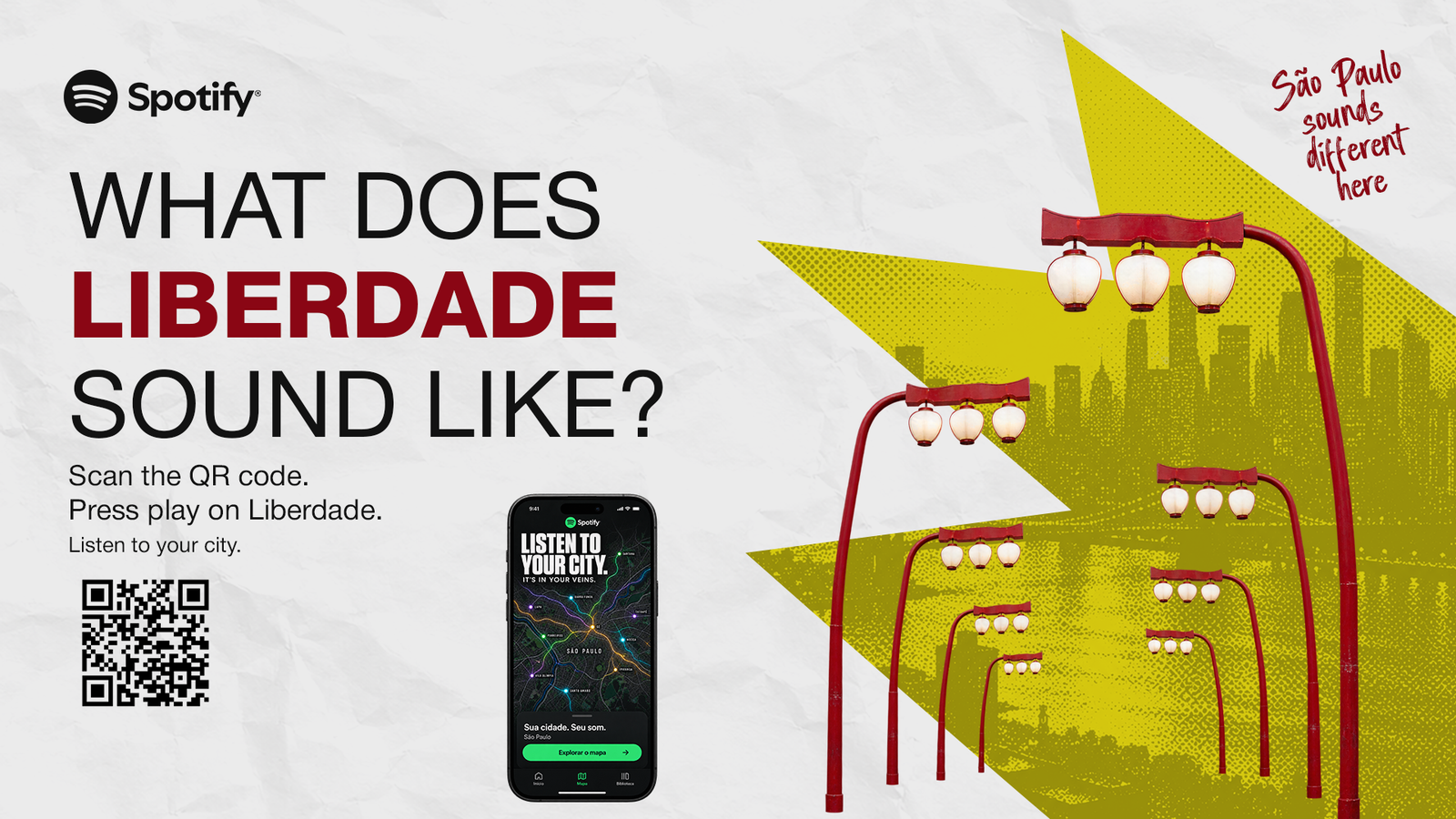
The Spotify concept starts with another question: what does this neighbourhood sound like? Local imagery, neighbourhood-specific artwork and playlists turn a place into an invitation to listen.
The proposed outdoor pieces connect the neighbourhood to a playlist through a QR code.
Liberdade’s lanterns and red-and-yellow palette make the location part of the invitation.
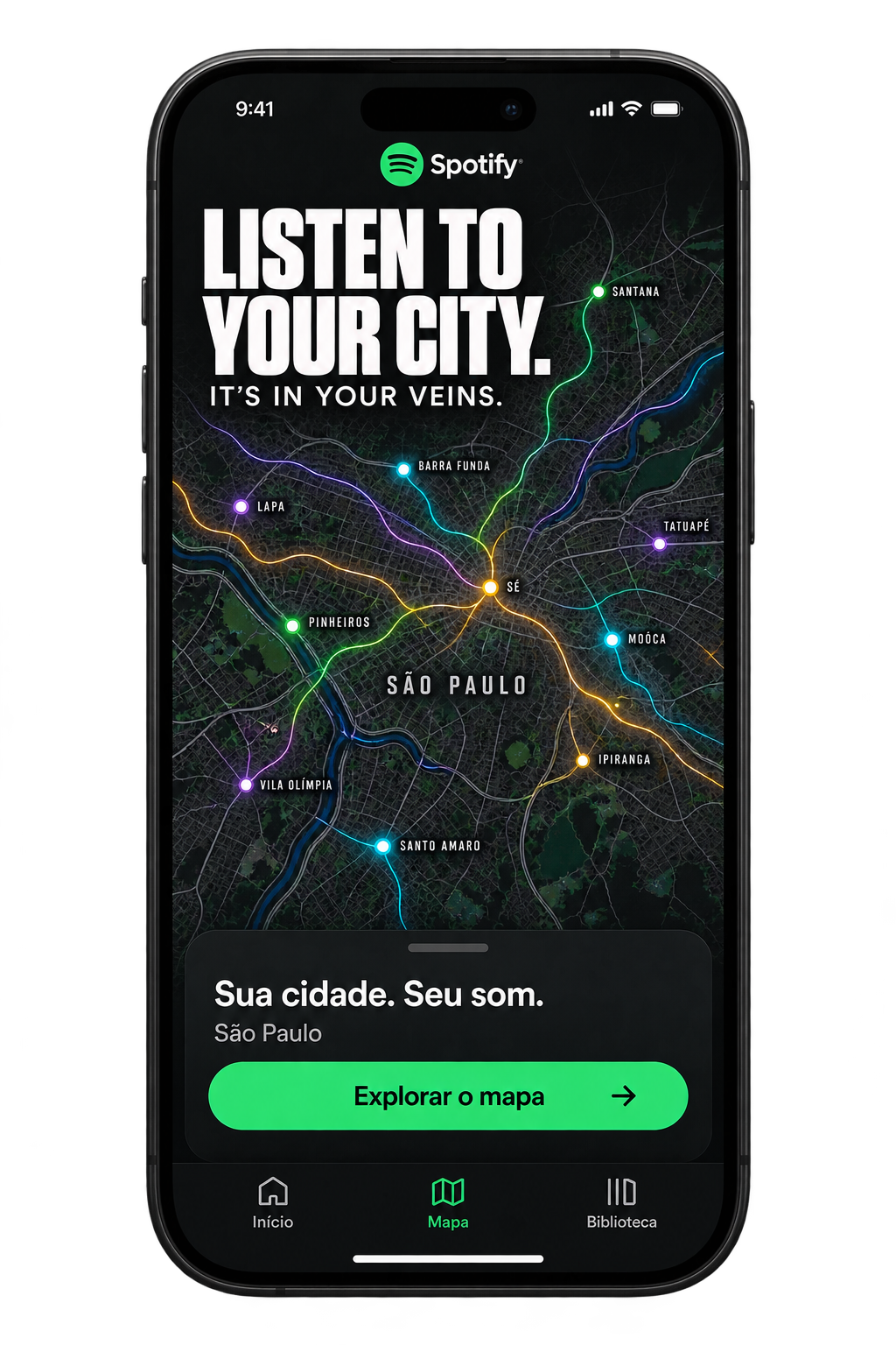
The campaign imagines a path from a neighbourhood’s outdoor piece to its playlist. The app mockup makes that connection visible, using the city map as a way into local listening.
The proposed QR entry connects the outdoor piece to the neighbourhood’s listening experience.
Self-initiated concept / AI-assisted imagery and app mockup. Illustrative interface and map.
APP CONCEPT / ORIGINAL MOCKUP
Google Maps and Spotify / Independent portfolio concepts, 2026.